*이 글을 읽기전에 작성자 개인의견이 있으니, 다른 블로그와 교차로 읽는것을 권장합니다.*
미디어 쿼리(media query)
1.반응형웹
하나의 웹사이트에서 pc, 스마트폰, 태블릿 등 접속하는 디스플레이 종류에 따라 화면의 크기가 자동으로 변하도록 만든 웹페이지 접근 방법입니다.
@media 매체유형 and (속성에 대한 조건) {
css 코드 ...
}
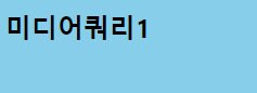
<!DOCTYPE html>
<html lang="en">
<head>
    <meta charset="UTF-8">
    <meta name="viewport" content="width=device-width, initial-scale=1.0">
    <title>미디어쿼리1</title>
    <style>
        body {background-color: skyblue;}

        @media screen and (min-width: 800px) {
            body {background-color: deepskyblue;}
        }
    </style>
</head>
<body>
    <h2>미디어쿼리1</h2>

</body>
</html>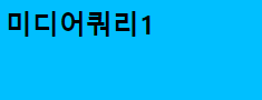
매체유형
all: 모든 매체
screen: 컴퓨터, 태블릿, 스마트폰 ..
print: 프린터
speech: 스크린 리더
2. em과 rem 특징
상대적인 크기를 정하는 단위입니다.
em
- 부모 요소 크기의 몇 배인지를 단위로 설정합니다.
pc의 일반 텍스트 크기: 16px = 1em
모바일의 일반 텍스트 크기: 12px = 1em
HTML
<div id='hello'> <!--32px, 부모한테 전달받은 px단위가 1em이 됩니다.-->
<div>안녕하세요!</div> <!--32px = 1em-->
</div>
CSS
#hello { font-size: 2em; }
rem
- 문서의 최상위 요소(html)의 몇 배 인지를 크기로 설정
HTML
<html>
<body>
<div id='hello'>
<div>안녕하세요!</div> <!--32px-->
</div>
<body>
</html>
CSS
html { font-size: 2rem } /* 16 * 2px */
<!DOCTYPE html>
<html lang="en">
<head>
<meta charset="UTF-8">
<meta name="viewport" content="width=device-width, initial-scale=1.0">
<title>미디어쿼리2</title>
<link rel="stylesheet" href="./../media.css">
</head>
<body>
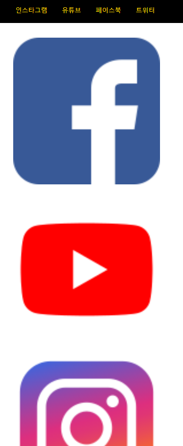
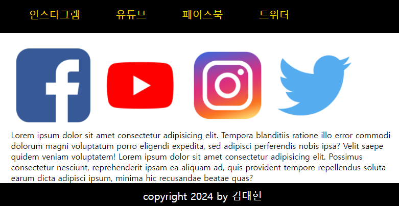
<div id="container">
<header>
<nav>
<ul>
<li>인스타그램</li>
<li>유튜브</li>
<li>페이스북</li>
<li>트위터</li>
</ul>
</nav>
</header>
<div id="contents">
<section id="intro">
<img src="./facebook.png" alt="페이스북">
<img src="./youtube.png" alt="유튜브">
<img src="./instagram.png" alt="인스타그램">
<img src="./twitter.png" alt="트위터">
</section>
<section>
<p>Lorem ipsum dolor sit amet consectetur adipisicing elit. Tempora blanditiis ratione illo error commodi dolorum magni voluptatum porro eligendi expedita, sed adipisci perferendis nobis ipsa? Velit saepe quidem veniam voluptatem! Lorem ipsum dolor sit amet consectetur adipisicing elit. Possimus consectetur nesciunt, reprehenderit ipsam ea aliquam ad, quis provident tempore repellendus soluta earum dicta adipisci ipsum, minima hic recusandae beatae quas?</p>
</section>
</div>
<footer>
<p>copyright 2024 by 김대현</p>
</footer>
</div>
</body>
</html>* {
margin: 0;
padding: 0;
box-sizing: border-box;
}
header {
width: 100%;
background-color: black;
margin-bottom: 20px;
}
nav > ul {
height: 50px;
list-style: none;
color: gold;
font-size: 13px
}
nav > ul > li {
float: left;
padding: 10px;
margin: 5px 5px;
}
/*
구형폰: 320px;
일반폰: 360px ~
*/
nav, #contents {
width: 320px;
margin: 0 auto;
}
#intro > img {
width: 100%;
padding: 10px;
}
#desc {
width: 100%;
padding: 10px;
line-height: 1.5;
}
footer {
width: 100%;
height: 50px;
padding: 10x;
background-color: black;
color: white;
}
footer > p {
text-align: center;
font-size: 16px;
line-height: 25px;
}
/* 태블릿: 768px ~ */
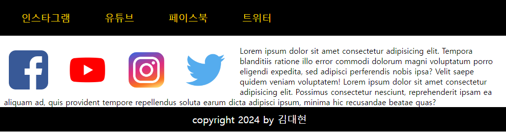
@media screen and (min-width: 768px) {
nav > ul {
font-size: 20px;
height: 80px;
}
nav > ul > li {
margin: 20px 25px;
}
nav, #contents {
width: 750px;
margin: 0 auto;
}
#intro {
width: 100%;
}
#intro > img {
width: 22%;
padding: 10px;
}
#desc {
width: 100%;
padding: 10px;
margin: 10px auto;
}
footer > p {
font-size: 20px;
line-height: 50px;
}
}
/* 데스크탑: 1024px ~ */
@media screen and (min-width: 1024px) {
nav, #contents {
width: 1000px;
margin: 0 auto;
}
#intro > img {
width: 10%;
padding: 10px;
float: left;
margin-right: 20px;
}
#desc {
height: auto;
font-size: 20px;
padding: 10px;
}
footer {
clear: both;
}
}
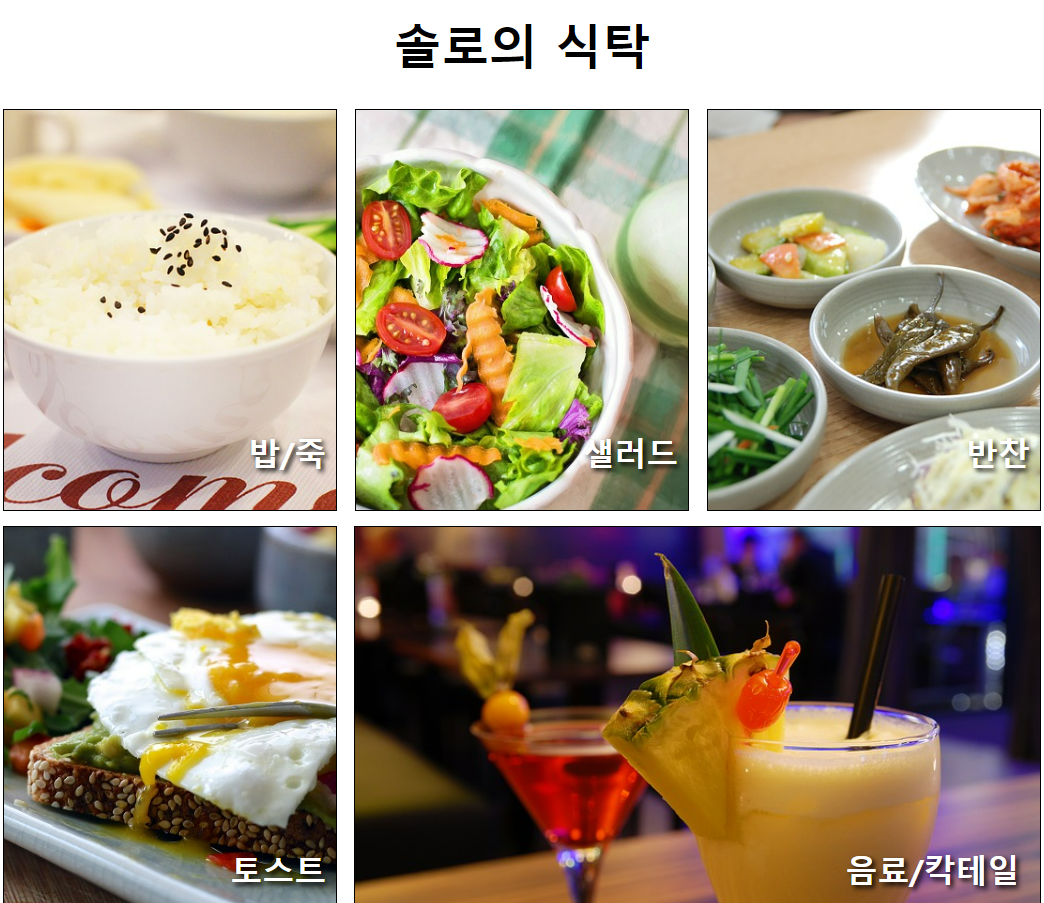
3. 미디어쿼리와 em을 이용한 웹화면 만들기 예시
<!DOCTYPE html>
<html lang="en">
<head>
<meta charset="UTF-8">
<meta name="viewport" content="width=device-width, initial-scale=1.0">
<title>솔로의 식탁</title>
<link rel="stylesheet" href="./../솔로의식탁.css">
</head>
<body>
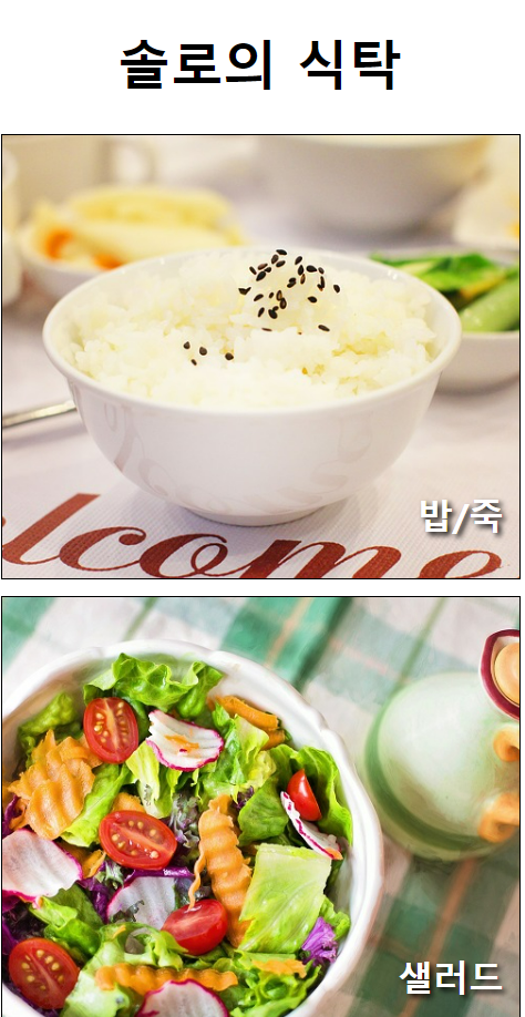
<div id="container">
<header>
<h1>솔로의 식탁</h1>
</header>
<section id="menus">
<div id="menu1">
<h2>밥/죽</h2>
</div>
<div id="menu2">
<h2>샐러드</h2>
</div>
<div id="menu3">
<h2>반찬</h2>
</div>
<div id="menu4">
<h2>토스트</h2>
</div>
<div id="menu5">
<h2>음료/칵테일</h2>
</div>
</section>
<footer>
<p>솔로의 식탁</p>
</footer>
</div>
</body>
</html>#container {
width: 100%;
}
header {
width: 100%;
}
header > h1 {
text-align: center;
font-size: 3em;
}
#menus {
width: 100%;
}
#menus > div {
height: 400px;
border: 1px solid black;
margin-bottom: 15px;
position: relative;
}
#menus h2 {
position: absolute;
right: 3%;
bottom: 10px;
font-size: 2em;
color: white;
text-shadow: 3px 3px 5px black;
}
#menu1, #menu2, #menu3, #menu4, #menu5 {
width: 100%;
}
#menu1 {
background: url(./Day3/dish1.jpg) no-repeat center/cover;
}
#menu2 {
background: url(./Day3/dish2.jpg) no-repeat center/cover;
}
#menu3 {
background: url(./Day3/dish3.jpg) no-repeat center/cover;
}
#menu4 {
background: url(./Day3/dish4.jpg) no-repeat center/cover;
}
#menu5 {
background: url(./Day3/dish5.jpg) no-repeat center/cover;
}
footer > p {
font-size: 1.5em;
color: white;
text-align: center;
line-height: 100px;
background-color: black;
}
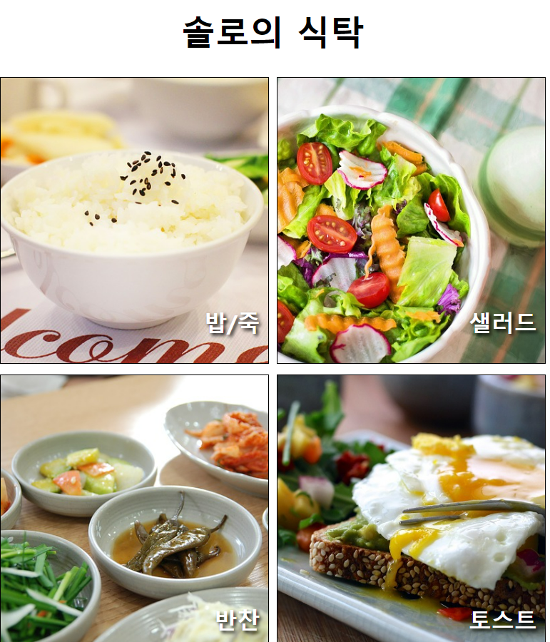
@media screen and (min-width: 768px) {
#menus {
display: flex;
flex-wrap: wrap;
justify-content: space-between;
}
#menu1, #menu2, #menu3, #menu4, #menu5 {
width: 49%;
}
}
@media screen and (min-width:1024px) {
#menu1, #menu2, #menu3, #menu4 {
width: 32%
}
#menu5 {
width: 66%;
}
}
'HTML+CSS > CSS' 카테고리의 다른 글
| 웹개발(14)-transform, transition, animation (0) | 2024.04.12 |
|---|---|
| 웹개발(13)- 우선순위, css변수 (0) | 2024.04.12 |
| 웹개발(11)-float, layout (0) | 2024.04.11 |
| 웹개발(10)-CSS position 지정 (0) | 2024.04.09 |
| 웹개발(9)-박스 모델(Box Model) (0) | 2024.04.09 |


